-
PLA 3.0
- You saw PLA 3.0 at our booth
- ---
- Explore PLA 3.0
- Compliance features
- Deployment
- ---
-
Experiments
- Parallel-line potency assays
- Parallel logistic potency assays (3PL, 4PL, 5PL)
- Slope ratio potency assays
- Quantal response potency assays
- Interpolation analysis
- Effective-concentration calculation (ECn)
- Spike-and-recovery analysis
- Cylinder-plate assays
- Turbidimetric assays
- ---
- Analyze the endotoxin concentration in a substance
- Import your data
-
Analyze your data with PLA 3.0
- Analyze Biological Potency Assays
- Analyze quantal response assays
- Analyze the dose-response relationship
- Analyze the endotoxin concentration in a substance
- Develop Equivalence margins
- Determine the potency of antibiotics
- Perform a curve comparisons
- Perform a Linearity-of-dilution assessment
- Perform a sophisticated statistical process control
- Perform combination calculations
- Advanced analysis
- Monitoring
- Supporting add-ons
- ---
- Event Calendar
- News
- Newsletter
- Get started
- Downloads
- Company
Perform a sophisticated statistical process control
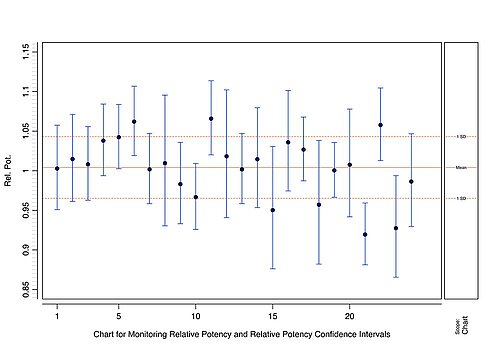
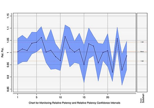
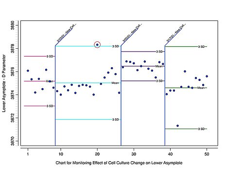
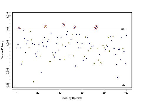
The Control Chart Package (available as a free add-on) allows sophisticated statistical process control (for example, by plotting Shewhart I-Charts as recommended in the USP <1010>). Detect out-of-control data by defining upper / lower control limits and control rules (Western Electric, Nelson, and user-defined). A status display provides feedback about the impact of a rule violation. Optional features include events to mark changes in the process, sidecharts to contain basic statistics in a box plot, the creation of subcharts for a specific range, and confidence intervals. Moreover, the data series can be colored by a secondary factor such as the operator name. Aggregate directly from independent assay runs or from manual input.
Features of the Control Chart Package
The following list highlights the USP <1010> methods supported by the Control Chart Package:
Extensive and independent configuration options on I-charts
- Individual chart (I-Chart). I-Charts monitor data such as measurements and regression parameters at regular intervals, with each data point within the chart representing a sample or an observation respectively.
All charts generated by the Control Chart package are I-Charts. You can manually add the chart data, or aggregate it from other PLA 3.0 documents such as Quantitative response assays or Dose-response assays.
Parameter statistics to view descriptive details for every chart
- The Control Chart package automatically calculates the following parameter statistics for each data series: mean and median, standard deviation (SD), coefficient of variation (CV), 1st and 3rd quartile, min. and max. values, number of values, and missing values. The statistics are displayed on the Dashboard and in the reports. In addition, you can configure confidence intervals and sidecharts to deeply analyze your data.
Statistical process control by defining control rules and control limits
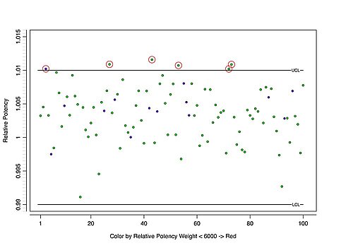
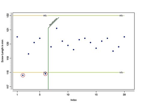
- Control limits define a range of acceptable values, determined by an upper and a lower limit. Any value outside of this range is considered to be a rule violation and needs to be marked as such. Use the Control Chart Package to set up rule sets with independently defined upper and lower control limits. These rules will be drawn as horizontal lines on your control chart.
Nelson & Western Electric Company (WECO) rules
- These decision rules allow detecting out-of-control or non-random conditions on control charts, based on deviations from the mean. They are also capable of detecting patterns or trends. For example, you can apply Nelson rule 3 to detect when six (or more) points in a row are continually increasing (or decreasing).
The Control Chart Package provides a set of predefined control rules (Nelson rules 1 to 8 and WECO rules 1 to 4) and also allows you to set up user-defined rules. You can also base control rules on parameter statistics of historical data. In contrast to control limits, where the limits can be defined independently, a control rule automatically applies to both the upper and the lower limits.
Calculation of the standard deviation
- USP <1010> recommends calculating the standard deviation using differences between consecutive data points instead of comparison to the overall mean.
The Control Chart Package supports both methods for estimating the standard deviation.
Basic concept of the Control Chart Package
The Control Chart Package supports you in statistical process control independently whether the data is derived from biological assays or your individual work environment.
You can plot data series into customizable charts to fit your needs: There are options to add intervals, sidecharts, and event markers, to create subcharts, or to define the coloring of data points by secondary characteristics or by threshold values, for instance. Furthermore, rule sets allow you to detect out-of-control data by configuring control limits and rules. A status display about the criticality of a rule violation provides visual feedback at a glance for you to take action on the process.
Use cases
The Control Chart Package covers a broad range of use cases not limited to biological assays.
You can aggregate data from individual assay documents (for example, quantitative response assays, dose-response analysis assays, or microbial assays for antibiotics) or enter data of any type manually. For example, you can plot a data series to get a first glimpse of descriptive statistics. Based on the statistical characteristics, you can apply control limits and rules to monitor the process and reveal out-of-control data. Use events to mark changes in the process, for example, when you changed the cell culture or updated your SOPs. Moreover, you can create subcharts if you wish to monitor a specific range of data separately, such as the most recent days only. Finally, you are able to color data points by threshold values or a secondary characteristic like the operator to associate conspicuities accordingly.
PLA 3.0 Control Chart Package Sample Reports
-
Sample Report for splitting a chart into subcharts 497 KB
This report shows the split of a single chart into ten subcharts with 1000 observations each. The user can define the total number of observations plotted and how many observations a single subchart contains. First, the subchart with the most recent observations is reported together with the full chart for an overview. Then, every subchart is presented, followed by an appendix containing the dataset. -
Sample Report for performing statistical process control 81 KB
This report shows the statistical process control features of the Control Chart Package. In this example, each chart represents a different estimate from an assay analysis. In addition, specific rule sets are applied. It is possible to reference the same rule set in different data series and to reference multiple rule sets in the same data series. If an observation violates a control limit/rule, it is marked with a colored circle. An overview of all violations is shown in the 'Violations' section. Violated rules will set the status (green, yellow, red) of the containing rule set, chart, and document according to their severity.


