-
PLA 3.0
- You saw PLA 3.0 at our booth
- ---
- Explore PLA 3.0
- Compliance features
- Deployment
- ---
-
Experiments
- Parallel-line potency assays
- Parallel logistic potency assays (3PL, 4PL, 5PL)
- Slope ratio potency assays
- Quantal response potency assays
- Interpolation analysis
- Effective-concentration calculation (ECn)
- Spike-and-recovery analysis
- Cylinder-plate assays
- Turbidimetric assays
- ---
- Analyze the endotoxin concentration in a substance
- Import your data
-
Analyze your data with PLA 3.0
- Analyze Biological Potency Assays
- Analyze quantal response assays
- Analyze the dose-response relationship
- Analyze the endotoxin concentration in a substance
- Develop Equivalence margins
- Determine the potency of antibiotics
- Perform a curve comparisons
- Perform a Linearity-of-dilution assessment
- Perform a sophisticated statistical process control
- Perform combination calculations
- Advanced analysis
- Monitoring
- Supporting add-ons
- ---
- Event Calendar
- News
- Newsletter
- Get started
- Downloads
- Company
New document reports and dashboard in PLA 3.0.5
The revised report design provides greater lucidity with a fresh and modern look, clear, uniformly applied layout, and a uniform color scheme in line with editors.
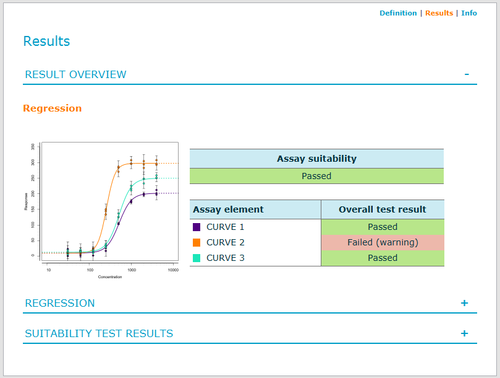
The dashboards display key attributes of document definitions and calculation results and visualize results in plots. The revised design provides greater lucidity with a fresh and modern look, clear, uniformly applied layout, and a uniform color scheme in line with editors.
Document reports
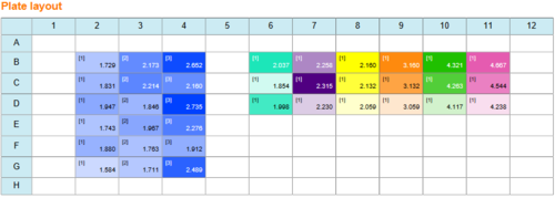
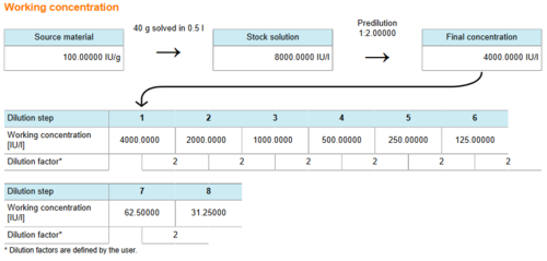
Examples for revised report features are the display of the plate layout that was used for the assay, and an enhanced visualization of preparation and dilution sequence of multi-dose samples.
Tip: Click the assay element link to jump to the details of the element in the report.
The image from the 'Linear calibration curve (enhanced response data processing)' sample document shows how the setup of a plate layout is now visualized in the new 'Plate layout' section.
The image from the 'Curve comparison' sample document shows how the preparation and dilution sequence of Test sample CURVE 3 is now visualized in the 'Working concentration' section.
Dashboard
The following image from the 'Curve comparison' sample document shows the calculation results as they are displayed on the document dashboard.
Use the links in the top right corner to navigate between different views on your data. You can switch to the definition of your assay setup, view additional information about the document, and return to the results view. Use the plus and minus signs at the right side of each area to expand or collapse the content as you require.
Tip: Click the assay element link to jump to the details of the element on the dashboard.


